Shryftoriz
- Client:Ukraine In Colour
- Industry:Typographic Foundry
- Year:2026
How to cultivate Ukrainian culture and make designers switch from russian to Ukrainian fonts? That's the question Ukraine in Colour asked.
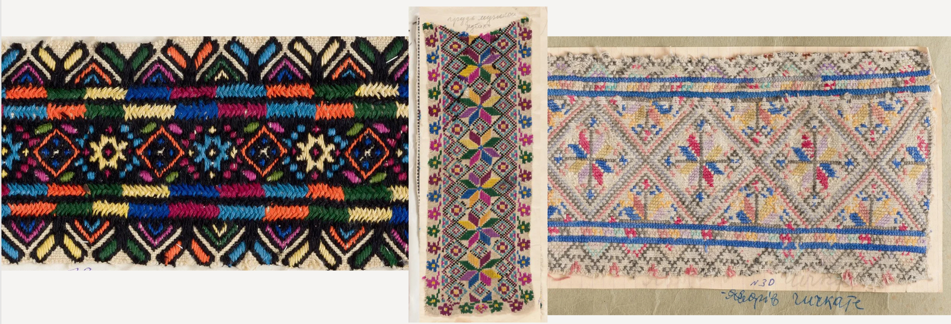
Shryftoriz — a play on the Ukrainian word for 'font cutter' — is a typographic platform built to answer it. The goal: give Ukrainian designers a native alternative and help build a distinct cultural identity in design, separate from russian visual language.
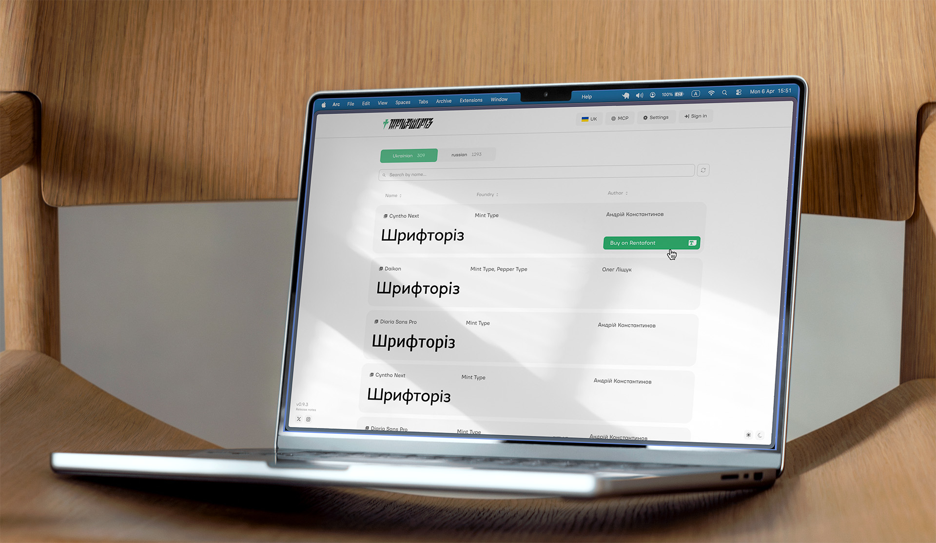
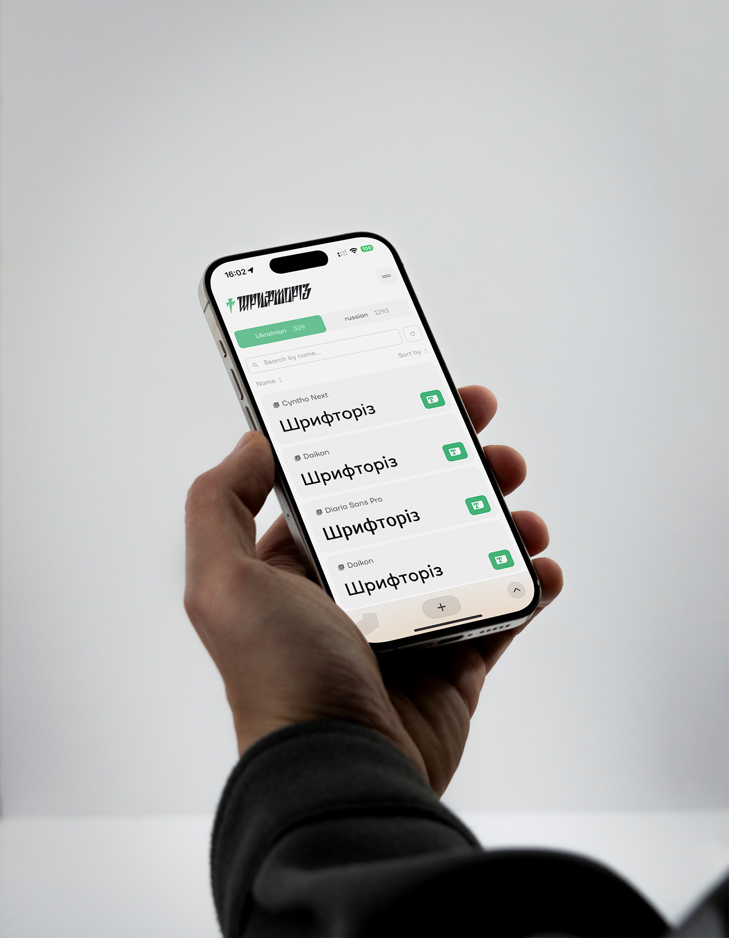
The app already existed. The visual identity had been crafted by designer Anastasiia Shyshenok. But the app interface itself was a different story — it had been generated by AI and it showed. The design lacked cohesion, felt generic, and read more like a marketing website than a product. That last point was a practical problem too: Apple's App Store guidelines are strict about apps that don't look and behave like apps.
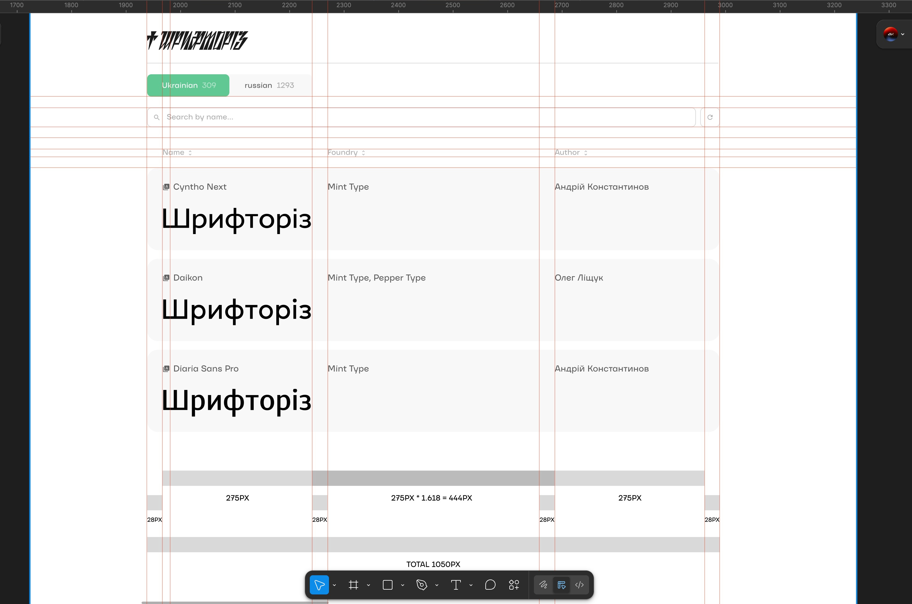
The redesign is rooted in Swiss design: white space, clear typographic hierarchy, a restrained color system, and nothing decorative that doesn't earn its place. It's clean, functional, and easy to navigate — the kind of design that holds up because it's built on principles, not trends.
I expanded the existing visual identity with a structured gray scale, defined typographic scaling rules, and brought consistency to spacing and layout that the original lacked.
The result, design direction is set: minimal, timeless, grounded in postmodern and Swiss design principles. The kind of foundation that will still feel right in ten years — which matters for a platform asking an entire professional community to change a habit.